Is Omicron Hiding Much Higher Inflation?
The CPI for December was 0.5% month over month, with a non-seasonally adjusted annual rate of 7.0%.
As the chart below shows, the December data reinforced a downward trend we’ve seen since a .95% reading in October. But is the recent omicron COVID spike hiding much higher inflation?
Unfortunately, the current downward trajectory can be attributed to items associated with a slow-down in Economic activity from Omicron. Energy and Transportation both saw modest declines. Specifically, Energy charted a big pullback compared to the last 3 months.
The rise in Energy and Transportation (e.g., car and truck rental) will most likely pick back up once Omicron has moved through the population similar to Delta. The chart below shows the inverse relationship between new COVID cases and Inflation.
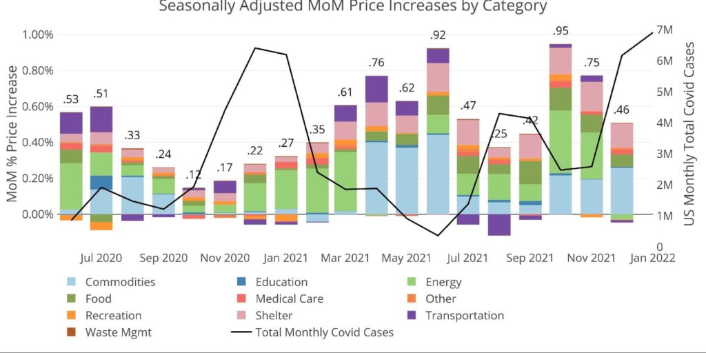
Figure: 1 Month Over Month Inflation
As shown above, higher cases slow inflation, and when cases head back down, inflation picks back up (presumable as the economy opens back up and spending increases). It should be noted that the impact of cases on inflation is weakening. For example, in June cases were below 400k against .92% MoM inflation. As Delta hit in July, cases surged to 1.37M and inflation fell to .47%. By August, cases reached 4.3M and inflation fell to .25%.
Before the Omicron variant, October showed .95% inflation against 2.5M cases. By December, cases hit 6.16M but inflation only fell back to .46%. Perhaps January has another weaker CPI with cases already at 7M and not even at the halfway point.
The correlation is quite stark, but this does not necessarily mean causation. The Fed must be hoping it’s not causation because when cases come back down and the economy opens up in the Spring, prices could explode higher. This would only tighten the bind the Fed already finds itself in.
In either case, the trend is established. As shown in the YoY chart below, inflation is still moving up. The base effects (e.g., the initial surge in used cars) should start falling off the calendar in the next few months. The Fed is hoping this will start to bring the inflation numbers back down. But what if this does not materialize? What if inflation keeps going up or just comes back to 5%?
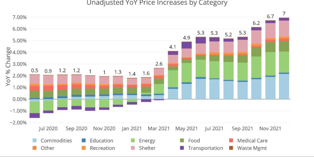
Figure: 2 Year Over Year Inflation
The chart below compares the recent numbers with the year-over-year monthly average. It seems that anything not related to Covid is sitting above the 12-month average. This implies that Omicron is most likely disguising much hotter inflation bubbling under the surface.
Shelter continues to creep up, though it is far below the true rate of rental increases. A recent private market assessment shows rental inflation greater than 20% in places like New York City. Imagine if the CPI reflected true cost of Shelter increases.
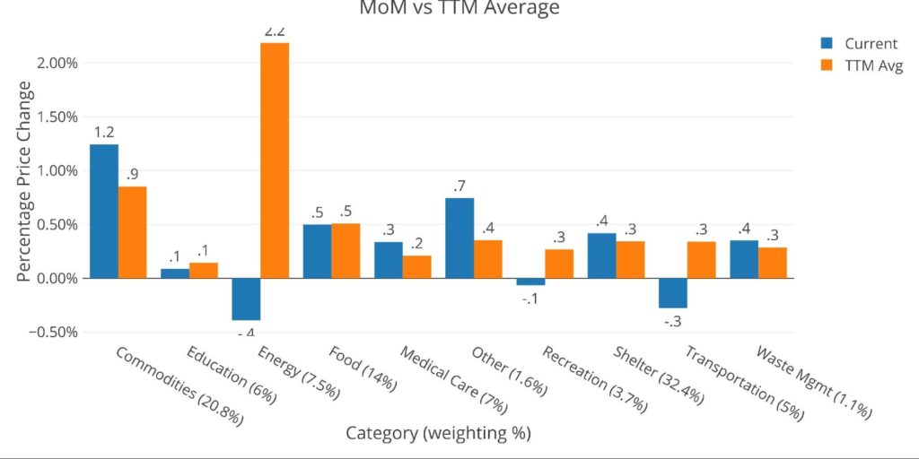
Figure: 3 MoM vs TTM
The table below gives a more detailed breakdown of the numbers. It shows the actual figures reported by the BLS side by side with the recalculated and unrounded numbers. The weighted column shows the contribution each value makes to the aggregated number. Details can be found on the BLS Website.
Note: this number does not sum to 100% because Household Operations has been removed. The BLS did not report this figure for December so it was removed. It represents less than 1% of the CPI so should not be material.
Some key takeaways:
- Shelter is up 4.18% YoY. This is by far the highest rate in the data set (available back to 2012)
- Specifically, Owners Equivalent Rent is up 0.4% MoM and 3.8% YoY. This is miles below the actual market rates being reported.
- Despite the pullback in Energy, prices are still up almost 30% YoY
- The 1.2% MoM move in Commodities was driven by Household Supplies (1.3%), Apparel (1.7%), Vehicles (2.1%)
- Each of those figures is larger than the previous month, further supporting the notion that Omicron is disguising a much hotter inflation number
- In November, those same categorizes were up: 0.7%, 1.3%, and 1.7% respectively
- Food was up 0.5% MoM and 6.3% YoY
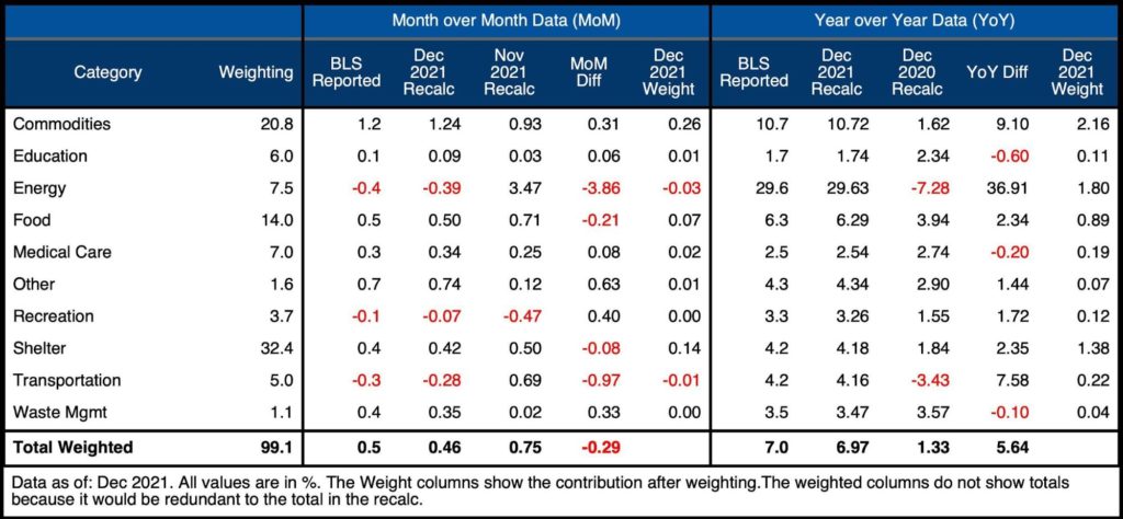
Figure: 4 Inflation Detail
In short, the headline number may have been below the previous month, but adjusting for Omicron, it’s probable December would have been hotter than November.
Looking at the Fed Numbers
While the Fed does have different categories, their aggregate numbers match to the BLS.
Their data goes back to the 1950s. Unfortunately, they do not publish the weightings of each category so it would be impossible to do a similar analysis showing the impact of each category on the overall number.
Looking at history back to 1950 puts the current spike into perspective. The current spike is much larger than the one seen pre-2008 and more closely resembles the move in 1972 when prices went from 3% to 11% in under two years. That inflation proved “transitory”, falling back to 5% in 1976 before reaching 14.6% in 1980. If the correlation in the money supply matches that of the 60s and 70s, then inflation could just be getting started. Without Paul Volker around to bring prices back down, what is the Fed banking on?
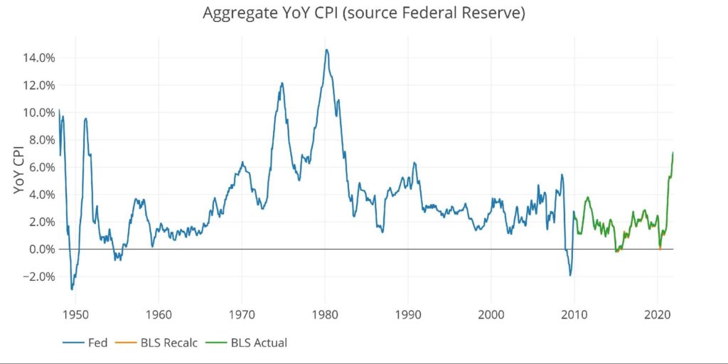
Figure: 5 Fed CPI
Using the Fed categorical data, which is different than the BLS, the next chart shows the current period versus TTM and trailing twenty years. As can be seen, excluding Education, the blue bars are showing higher readings across every category not tied to Covid (Recreation and Transportation).
When Omicron passes, it’s quite possible all categories will be well above historic averages in 2022.
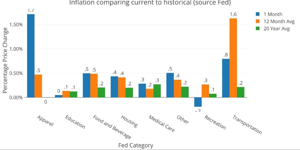
Figure: 6 Current vs History
Historical Perspective
Recalculating the BLS number is not a perfect science. The weightings must be scraped from the web pages. The index data is then gathered using an API. Each index comes seasonally adjusted and unadjusted. Regardless, putting the historical data together provides a good perspective on the current period.
The BLS weightings have only been scraped back to 2012, thus the chart below shows the past 9 years of annual inflation data. The volatility in Energy can be seen clearly over this time period. The base effect in transportation (purple) can also be seen with the decreases in 2020 followed by the increases in 2021. Finally, the recent impact of Commodities (goods, not energy) can be seen in the chart clearly.
Nothing about this chart could make someone believe the problem will fix itself, especially with the Biden administration pushing for more spending. To bring this chart back down, the Fed would have to get very aggressive or the economy would need to experience a major deflationary event. But we also know how the Government would respond (massive money printing).
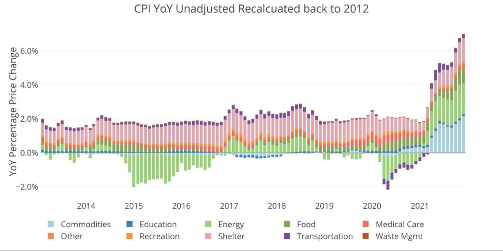
Figure: 7 Historical CPI
The historical weightings show that there is not much change over time across categories. It also shows the massive weighting given to Shelter which is why Owners Equivalent Rent has had such a strong impact on anchoring reported inflation.
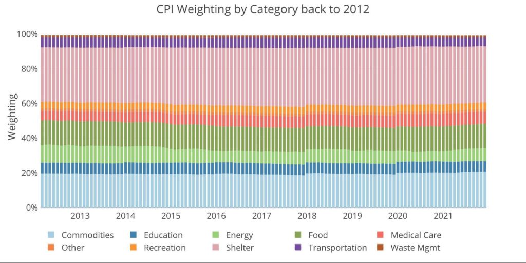
Figure: 8 CPI Weighting
What it means for Gold and Silver
CPI data has been having less impact on daily movement in gold and silver prices. It seems the market has priced in higher inflation in the months ahead, slowly abating as a “hawkish” Fed tries to combat inflation.
Not priced into the market is inflation in 2022 exceeding 2021. A Fed that folds is also not priced into the market or else gold and silver would be many magnitudes higher. The Fed can hope inflation cools on its own, but the data does not suggest this as highly probable. When Omicron passes, CPI prints could exceed 1% a month.
Putting speculation aside (maybe peak inflation is already in the rearview mirror), the math is pretty straightforward. Ballooning debt, coupled with record trade deficits and extremely high budget deficits lead to a single outcome: more Fed support. Physical gold and silver offer the best insurance against the long-term trajectory ahead.
Data Source: https://www.bls.gov/cpi/ and https://fred.stlouisfed.org/series/CPIAUCSL
Data Updated: Monthly within first 10 business days
Last Updated: Dec 2021
Interactive charts and graphs can always be found on the Exploring Finance dashboard: https://exploringfinance.shinyapps.io/USDebt/


 The Comex report last month showed a lot of strength in gold which directly preceded a massive up move for the price of gold. The data is looking similar in silver this month!
 Money Supply is a very important indicator. It helps show how tight or loose current monetary conditions are regardless of what the Fed is doing with interest rates. Even if the Fed is tight, if Money Supply is increasing, it has an inflationary effect.
 The analysis below covers the Employment picture released on the first Friday of every month. While most of the attention goes to the headline number, it can be helpful to look at the details, revisions, and other reports to get a better gauge of what is really going on.
 In February, the data showed that Yellen was making a big bet that long-term rates would not stay elevated for long. This was demonstrated by the volume of short-term debt issuance. The Treasury was willing to pay higher rates to keep the maturity of the debt shorter.