Peter's Blog
Get the latest headlines, market analysis, and original content from SchiffGold.
Exploring Finance

Government Spending has Increased 89% since 2016 to $7.2T
Federal Budget The Federal Government publishes the spending and revenue numbers on a monthly basis. The charts and tables below give an in depth review of the Federal Budget, showing where the money is coming from, where it is going to, and the surplus or deficit. The government fiscal year closes at the end of […]

Exclusive Weekly Email Updates
Peter Schiffs's Gold News
 Original Analysis
 Videos
 Interviews
 Guest Commentaries
 Key Gold Headlines
 Gold Scams Exposed
 Exploring Finance
Household Survey Shows 500k Jobs Lost in June while Labor Force Participation Crashes to Multi-year lows
The analysis below covers the Employment picture released on the first Friday of every month. While most of the attention goes to the Headline Report, it can be helpful to look at the details, revisions, and other reports to get a better gauge of what is really going on. Current Trends The jobs report showed […]

CFTC CoTs: Managed Money Gets Bullish on Gold
Please note: the CoTs report was published 06/26/2026 for the period ending 06/23/2026. “Managed Money” and “Hedge Funds” are used interchangeably. The Commitment of Traders report is a weekly publication that shows the breakdown of ownership in the Futures market. For every contract, there is a long and a short, so the net positioning will […]
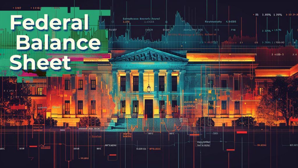
The Fed Balance Sheet Increases by $31B in June
The following analysis breaks down the Fed balance sheet in detail. It shows different parts of the balance sheet and how those amounts have changed. It also shows historical interest rate trends. Breaking Down the Balance Sheet As soon as the Fed ended Quantitative Tightening they launched a new round of Quantitative Easing. As shown […]

Physical Demand for Gold Remains Strong even while Silver Sees Slowing Delivery Volume
The CME Comex is the Exchange where futures are traded for gold, silver, and other commodities. The CME also allows futures buyers to turn their contracts into physical metal through delivery. You can find more detail on the CME here (e.g., vault types, major/minor months, delivery explanation, historical data, etc.). The data below looks at […]

Fed Talks Tough But Money Supply Explodes Higher
Money Supply is a very important indicator. It helps show how tight or loose current monetary conditions are regardless of what the Fed is doing with interest rates. Even if the Fed is tight, if Money Supply is increasing, it has an inflationary effect. One key metric shown below is the “Wenzel” 13-week annualized money […]

The Technicals: Getting Closer to a Bottom, but Not There Yet
Technical Analysis of Gold and Silver This analysis attempts to look at different metrics to understand the current momentum in the gold and silver markets. It is meant as an analysis on potential price direction in the very short-term (a few weeks to 1-2 months). In Q4, the technical analysis was strongly calling for a […]
International Countries have only bought 10% of total new debt over 18 months
The following analysis breaks down the Fed balance sheet in detail. It shows different parts of the balance sheet and how those amounts have changed. It also shows historical interest rate trends. Breaking Down the Balance Sheet As soon as the Fed ended Quantitative Tightening they launched a new round of Quantitative Easing. As shown […]
Gold Continues to See Consistent Exit of Metal from Comex Vaults
The CME Comex is the Exchange where futures are traded for gold, silver, and other commodities. The CME also allows futures buyers to turn their contracts into physical metal through delivery. You can find more detail on the CME here (e.g., vault types, major/minor months, delivery explanation, historical data, etc.). The data below looks at […]
13 Week Money Supply Growth Hits Highest Level Since 2022
Money Supply is a very important indicator. It helps show how tight or loose current monetary conditions are regardless of what the Fed is doing with interest rates. Even if the Fed is tight, if Money Supply is increasing, it has an inflationary effect. One key metric shown below is the “Wenzel” 13-week annualized money […]
US Government Approaches $40T in Total Debt Outstanding
Current Trends The US government has borrowed nearly $450B in the last three months. While this is a gargantuan sum of money, it annualizes to ~$1.9T which would be the smallest year of borrowing since 2022. Unfortunately, the trend more likely to hold is the borrowing seen in Feb and March which clocked in at […]