

Money Supply Sees Major Jump in Recent Weeks

Money Supply is a very important indicator. It helps show how tight or loose current monetary conditions are regardless of what the Fed is doing with interest rates. Even if the Fed is tight, if Money Supply is increasing, it has an inflationary effect.
One key metric shown below is the “Wenzel” 13-week annualized money supply figure. It was made popular by the late Robert Wenzel who tracked the metric weekly as an indicator of where the economy might be headed. In 2020, the Fed started reporting the data monthly instead of weekly. It should also be noted that Money Supply data can be heavily revised in future months.
Recent Trends
Seasonally Adjusted Money Supply is delayed by a month. The large increase in seasonally adjusted Money Supply shown below occurred in March.
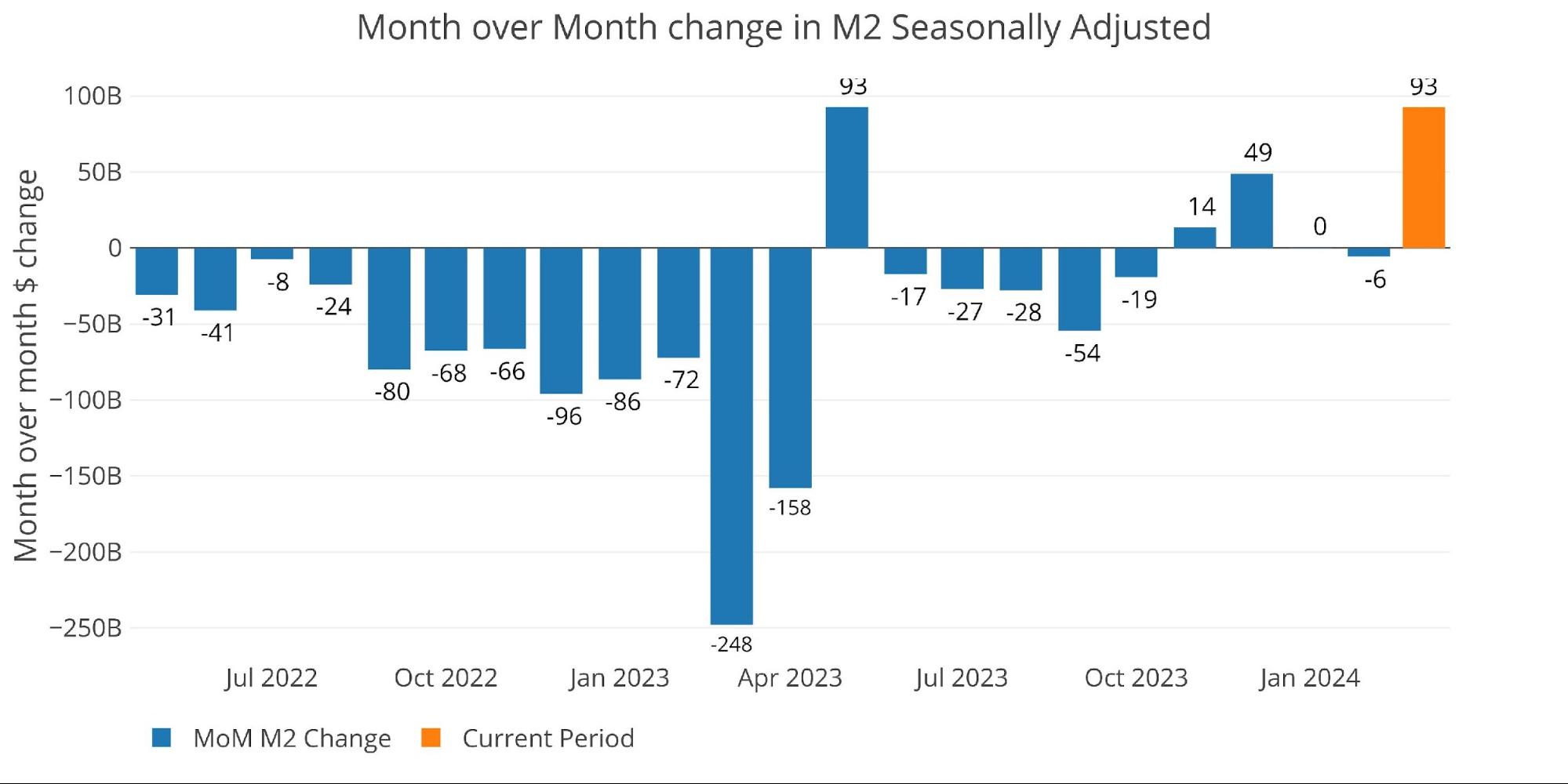
Figure: 1 MoM M2 Change (Seasonally Adjusted)
March was a large surge with an annualized increase of 5.5%.

Figure: 2 M2 Growth Rates
That is actually well above the March average of +4.6%.
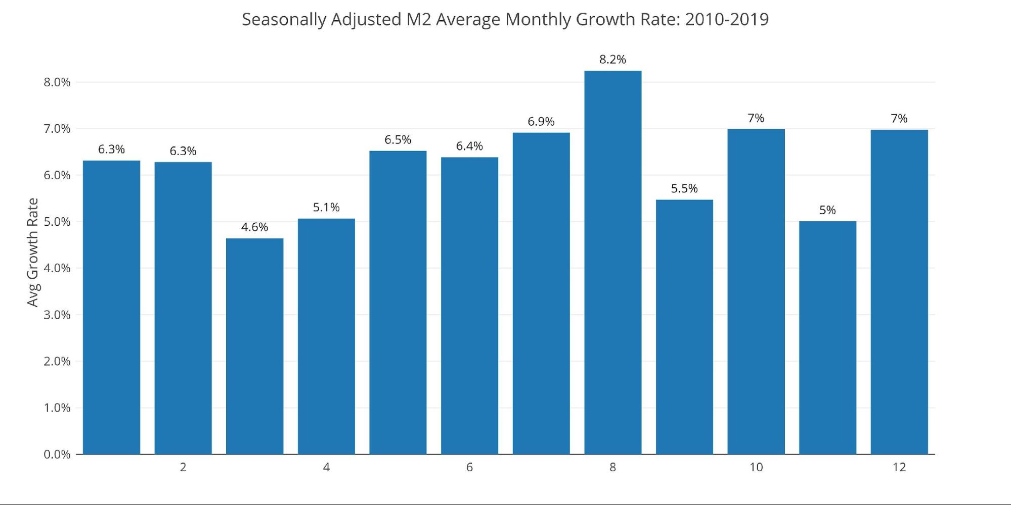
Figure: 3 Average Monthly Growth Rates
Non-seasonally adjusted numbers show data through early April, with a large uptick in the two most recent periods.
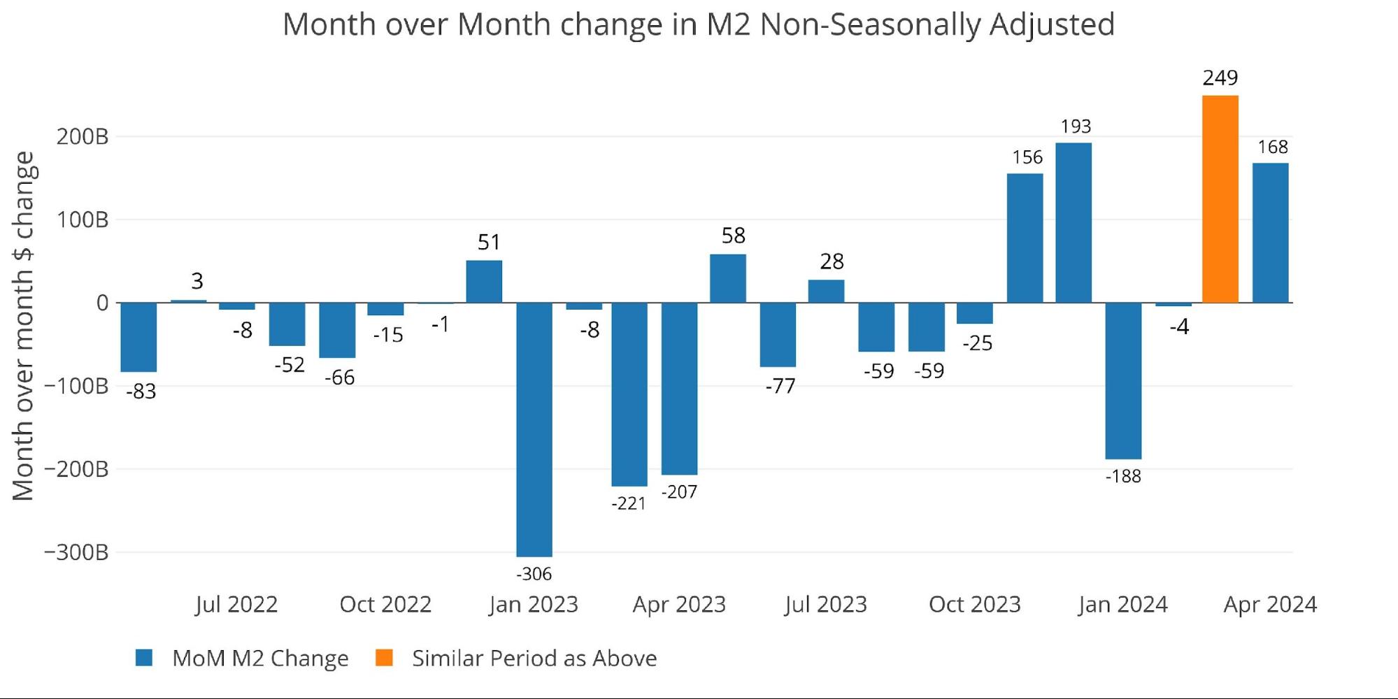
Figure: 4 MoM M2 Change (Non-Seasonally Adjusted)
The weekly data below shows the activity over the last month in unadjusted money supply. You can see the big jump in 4 of the last 5 weeks.
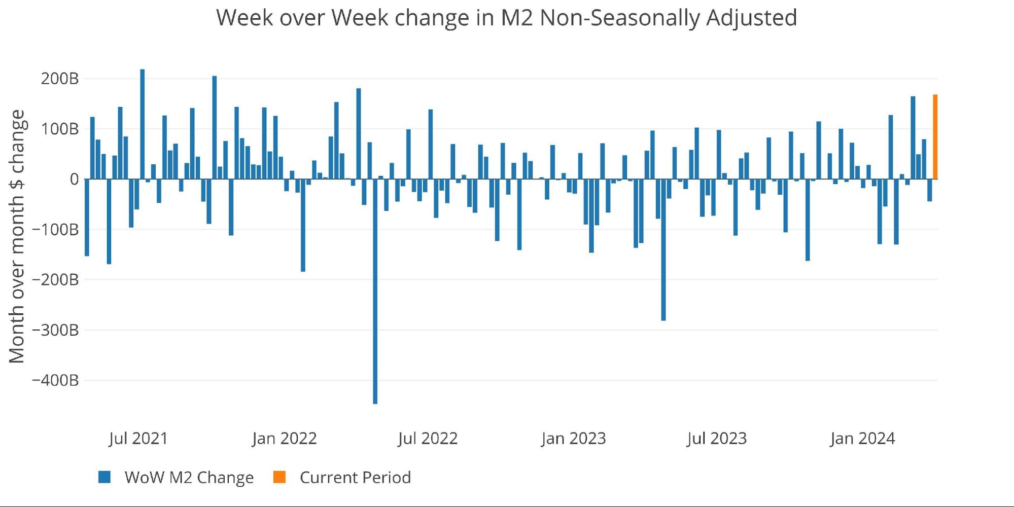
Figure: 5 WoW M2 Change
The “Wenzel” 13-week Money Supply
The late Robert Wenzel of Economic Policy Journal used a modified calculation to track Money Supply. He used a trailing 13-week average growth rate annualized as defined in his book The Fed Flunks. He specifically used the weekly data that was not seasonally adjusted. His analogy was that in order to know what to wear outside, he wants to know the current weather, not temperatures that have been averaged throughout the year.
The objective of the 13-week average is to smooth some of the choppy data without bringing in too much history that could blind someone from seeing what’s in front of them. The 13-week average growth rate can be seen in the table below. Decelerating trends are in red and accelerating trends are in green. The last 10 weeks have been fairly flat compared to the last few years.


Figure: 6 WoW Trailing 13-week Average Money Supply Growth
The plot below shows how this year compares with previous years. As mentioned, the recent period has been quite flat compared to history. The current year is below average for this time of year. Money Supply should dip some heading into the summer before rebounding later in the year. However, based on the recent weekly data, Money Supply might increase in the next report before trending back down.
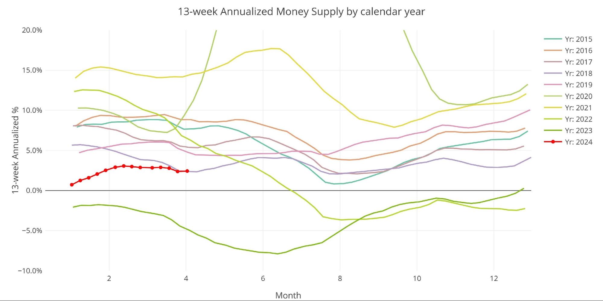
Figure: 7 Yearly 13-week Overlay
Inflation and Money Supply
The chart below shows the history of inflation, Money Supply, and Fed Funds. As shown, in 1970 inflation worked with 2 year lag compared to Money Supply. Given this, it is possible that another bout of inflation is lurking just under the surface.
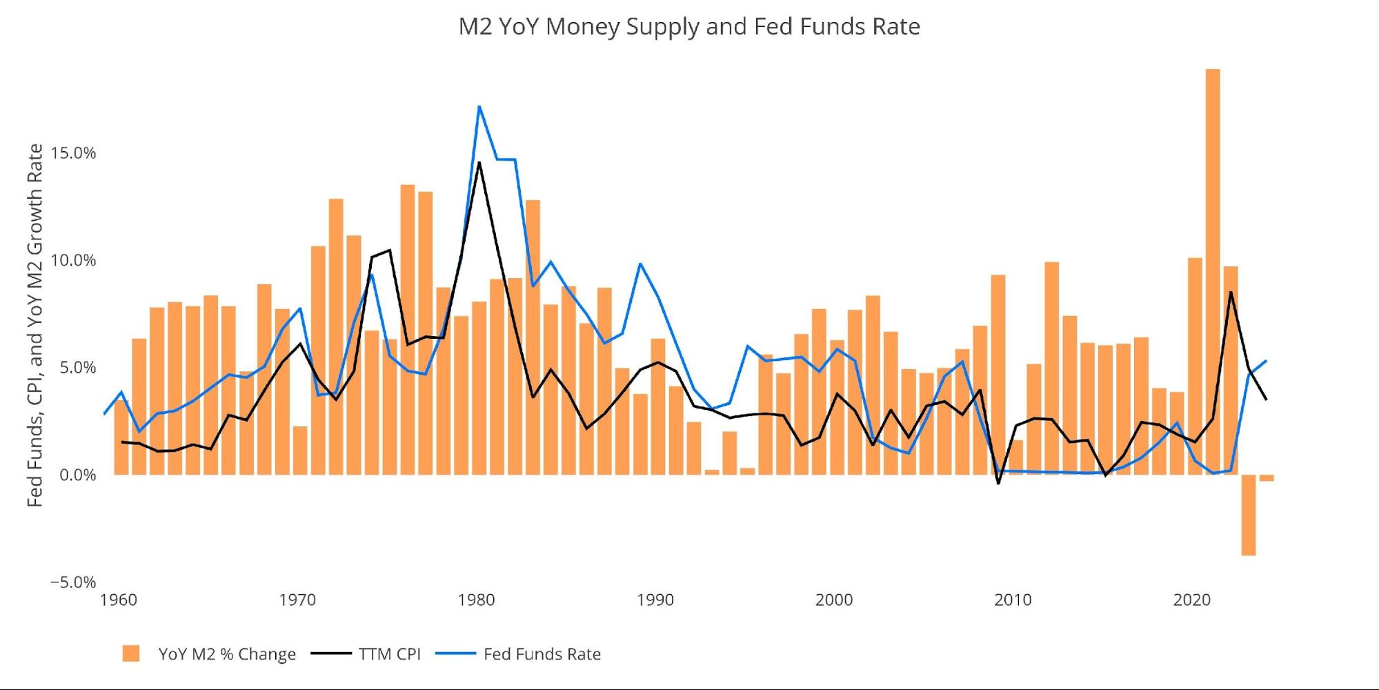
Figure: 8 YoY M2 Change with CPI and Fed Funds
Historical Perspective
The charts below are designed to put the current trends into historical perspective. The orange bars represent annualized percentage change rather than a raw dollar amount.
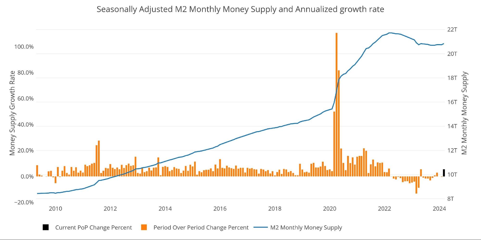
Figure: 9 M2 with Growth Rate
Below is the 13-week annualized average over history. This chart overlays the log return of the S&P. Mr. Wenzel proposed that large drops in Money Supply could be a sign of stock market pullbacks. His theory, derived from Murray Rothbard, states that when the market experiences a shrinking growth rate of Money Supply (or even negative) it can create liquidity issues in the stock market, leading to a sell-off.
While not a perfect predictive tool, many of the dips in Money Supply precede market dips. Specifically, the major dips in 2002 and 2008 from +10% down to 0%. 2022 was highly correlated with a fall in Money Supply and the rebound has corresponded with the big stock market move we have seen recently.
Please note the chart only shows market data through April 1st to align with available M2 data.
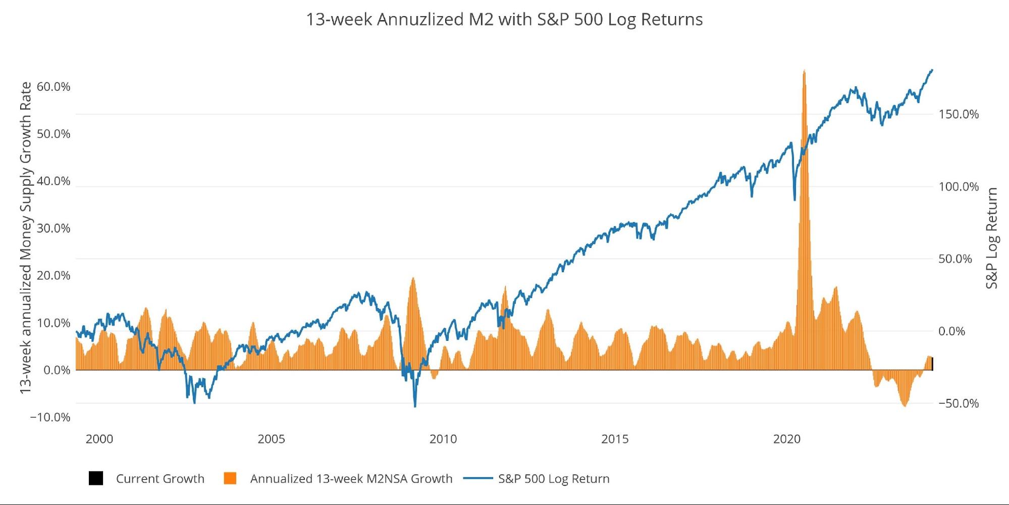
Figure: 10 13-week M2 Annualized and S&P 500
One other consideration is the reverse repo market at the Fed. This is a tool that allows financial institutions to swap cash for instruments on the Fed balance sheet.
Reverse Repos peaked at $2.55T on Dec 30, 2022. Money has been gushing out ever since. While the Fed has been maintaining higher interest rates, this drop in reverse repos is certainly providing liquidity to the economy, driving Money Supply and the stock market higher.
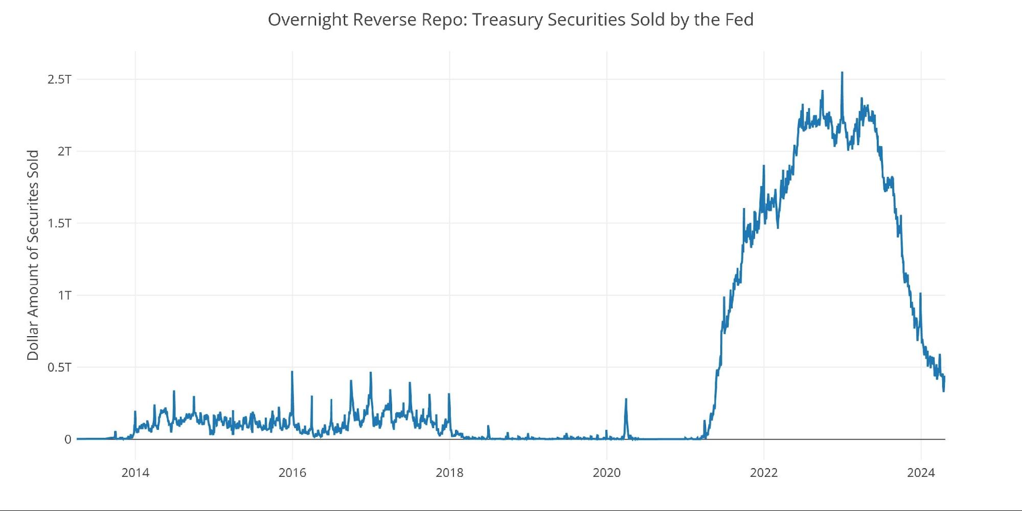
Figure: 11 Fed Reverse Repurchase Agreements
Wrapping Up
Money Supply can be a leading indicator and help explain the action in the stock market. Money Supply fell the entire year of 2022, bottomed in early 2023, and has been rising since. Keeping an eye on Money Supply can help one understand how much wind the stock market has on its back.
Data Source: https://fred.stlouisfed.org/series/M2SL and also series WM2NS and RRPONTSYD. Historical data changes over time so numbers of future articles may not match exactly. M1 is not used because the calculation was recently changed and backdated to March 2020, distorting the graph.
Data Updated: Monthly on fourth Tuesday of the month on 3-week lag
Most recent data: Apr 01, 2024
Interactive charts and graphs can always be found on the Exploring Finance dashboard: https://exploringfinance.shinyapps.io/USDebt/

Get Peter Schiff’s most important gold headlines once per week – click here – for a free subscription to his exclusive weekly email updates.
Interested in learning how to buy gold and buy silver?
Call 1-888-GOLD-160 and speak with a Precious Metals Specialist today!
 The analysis below covers the Employment picture released on the first Friday of every month. While most of the attention goes to the headline number, it can be helpful to look at the details, revisions, and other reports to get a better gauge of what is really going on.
 This analysis attempts to look at different metrics to understand the current momentum in the gold and silver markets. It is meant as an analysis of potential price direction in the very short term (1-2 weeks).
 The Comex report last month showed a lot of strength in gold which directly preceded a massive up move for the price of gold. The data is looking similar in silver this month!
 In February, the data showed that Yellen was making a big bet that long-term rates would not stay elevated for long. This was demonstrated by the volume of short-term debt issuance. The Treasury was willing to pay higher rates to keep the maturity of the debt shorter.