Comex Stock Update: July 2021
This analysis focuses on gold and silver within the Comex/CME futures exchange See the article What is the Comex? for more detail. It provides historical context and defines many of the terms used below.
While it is exciting to track the countdown to First Notice to determine how many contracts will stand for delivery in a given month, the real movement of metal occurs in the stock report which shows metal entering and leaving the Comex system as well as ownership of physical metal. The charts and tables below analyze this data to track the change in trend that occurred with the Covid pandemic in early 2020 as noted in What is the Comex?.
Understanding the Trends
Silver
Below shows the total amount of Eligible and Registered silver in the Comex system going back to early 2018. In July of 2020, silver saw a record number of contracts stand for delivery. JP Morgan responded by moving nearly 30M ounces of silver from Eligible into Registered making it immediately available to settle delivery contracts. While Registered had been making up only about 25% of total Comex stock, this move by JP Morgan instantly jumped the amount to 40% (see black line below).
Since then, silver has been flowing back into Registered, bringing that percentage down from its recent highs. Then in late February, Comex inventory started to decline in line with the Reddit Silver squeeze. The squeeze was about testing the physical market to see how much metal stood behind all the paper contracts that were traded on the Comex. As the chart shows, despite the media deeming the squeeze a “failure” the physical market has continued to see pressure. Premiums on bullion remain above January levels across nearly all products.
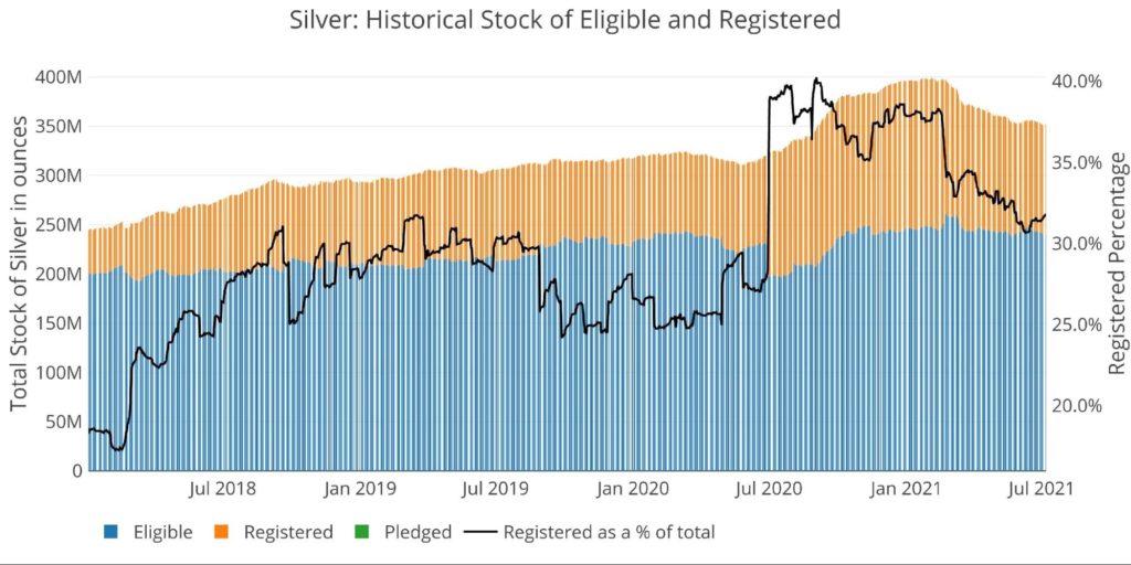
Figure: 1 Historical Eligible and Registered
The chart below looks at the net change in total warehouse stock since February 2019. As can be seen, the total stock surged in response to record delivery volume in 2020. However, the squeeze which was laser-focused on the physical market has been draining physical silver each month since February. Although figure 1 above shows a large stock of metal still remaining, it is impossible to ignore the trend below. Tracking this data going forward may give clues to how much stress exists in the physical market.
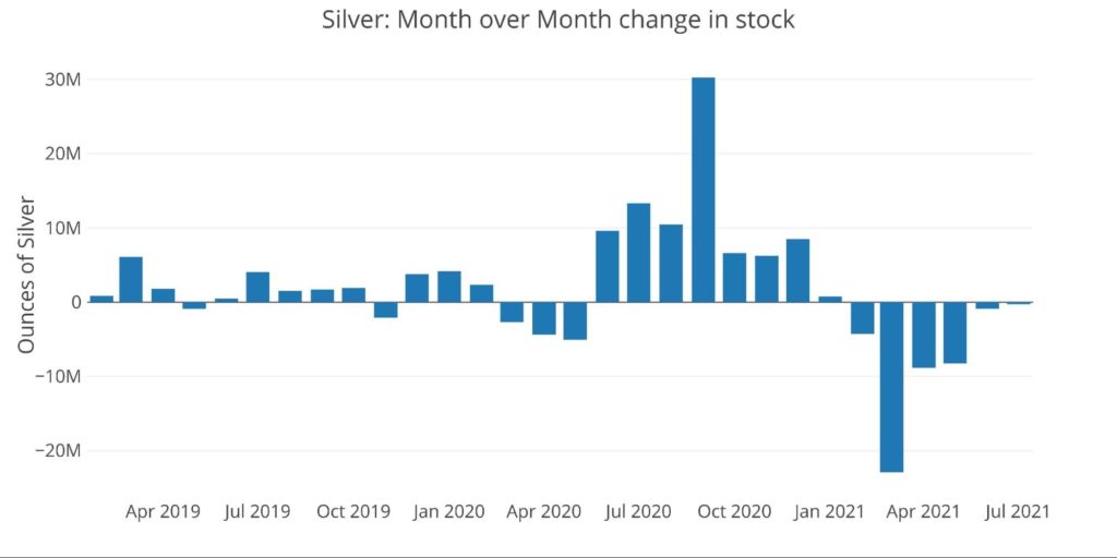
Figure: 2 Recent Monthly Stock Change
Another data point often referenced in the silver market is the amount of volume that occurs relative to available silver. On high-volume days, people may notice that more ounces exchanged hands than are physically produced in an entire year by silver mining companies. While this may be true, that is also the nature of the Comex paper futures market, which is designed to offer liquidity to individuals. This final silver chart compares both total silver stock and registered silver with the amount of Open Interest in silver over time. A high ratio indicates there is less silver in the Comex system relative to the amount of Open Interest.
As can be seen, this ratio has fallen over the last year as Open Interest collapsed in March 2020. After reaching a high above 240k contracts, silver has not held above 180k contracts since, despite record delivery volume. In parallel, the increase in stock noted above also worked to drive down the ratio of open interest to available silver.
Gold
The same charts for silver are repeated below for gold. As can be seen, the move last year is far more pronounced in the gold market than the silver market. Prior to COVID, the amount of Registered gold relative to total stock had fallen to under 3%! When physical deliveries skyrocketed in early 2020, it put an immediate strain on the system causing the Comex to change its rules and allow more stock to come into the system through London.
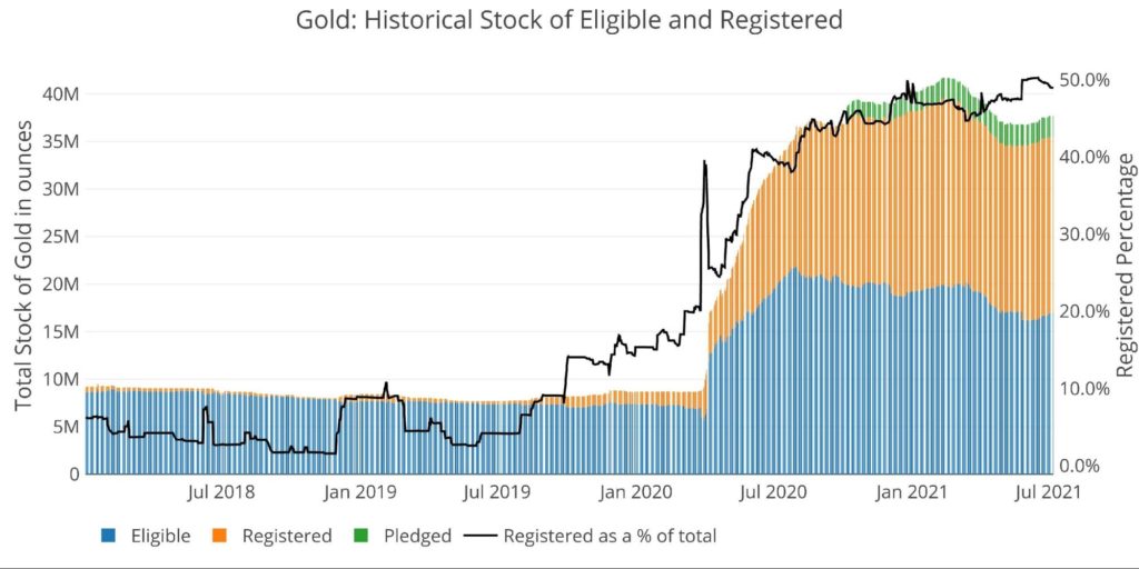
Figure: 4 Historical Eligible and Registered
As shown below, the initial surge in inventory was very strong. The responding outflow has not matched the equivalent outflow in silver. June even saw an uptick in inventory.
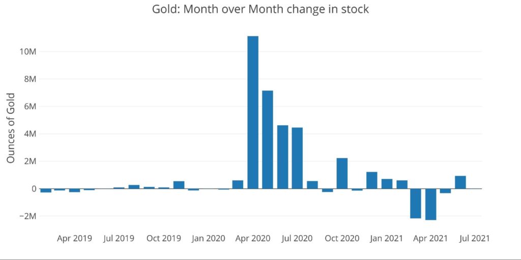
Figure: 5 Recent Monthly Stock Change
Finally, the ratio of total gold Comex stock to open interest can be seen below. As shown, the surge in gold inventory from making London bars available brought the ratio from over 9 back below 2. The Registered to Open Interest is only shown after March 31, 2020, because it distorts the graph by too large a degree.
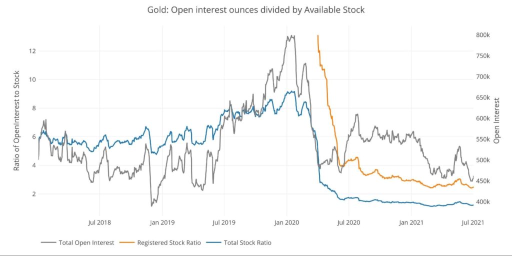
Figure: 6 Open Interest/Stock Ratio
Digging into the Recent Numbers
Looking at the latest numbers shows where the current gold/silver open interest ratio currently stands compared to recent history. Gold and silver see total stock to open interest ratios at 1.2 and 2.2 respectively. These clock in at the lower end of the range and even sit below the monthly and yearly average. This means the amount of physical relative to paper is not stretched as far as the recent and more distant past.

Figure: 7 Open Interest to Stock Ratio
The summary stock data table below shows the recent trends in both gold and silver. As shown the YTD change is negative in both metals, but silver has been hit almost twice as hard as gold (11.3% vs 6.3%). Registered silver has been hit particularly hard (>25% YTD) as parties are draining the available supply. Comparing the weekly daily average to the YTD daily average is the clearest picture of what has changed in the most recent period. As shown, while gold saw a reversal as more stock came into the Comex system, silver was bleeding out at a faster pace than average for the year so far (418k vs 346k).
This may be due to the recent delivery volume, where silver saw some very extreme activity in the day before and after First Notice, specifically the largest drawdown in open interest in the final day, followed by an abnormally large cash settlement of contracts. This data will be reviewed in greater detail in the next Comex article.
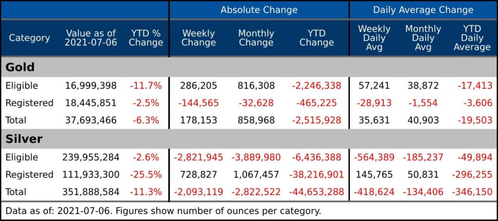
Figure: 8 Stock Change Summary
The last table below, shows the activity by bank/Holder. It shows where the supply came from in 2020 and also where the drainage has been coming from in 2021.
- In 2020, JP Morgan was the bank that provided the surge in supply of both gold (11M ounces) and silver (33M ounces)
- Manfra took over the Bank of Nova Scotia
- Silver 2021 drainage has been focused on HSBC and CNT
- Gold 2021 drainage has affected Holders across the board
This data and analysis will be refreshed monthly to continue tracking the physical movement of silver and gold within the Comex system. The data is showing abnormalities when compared to history, so it will be interesting to see if that continues.
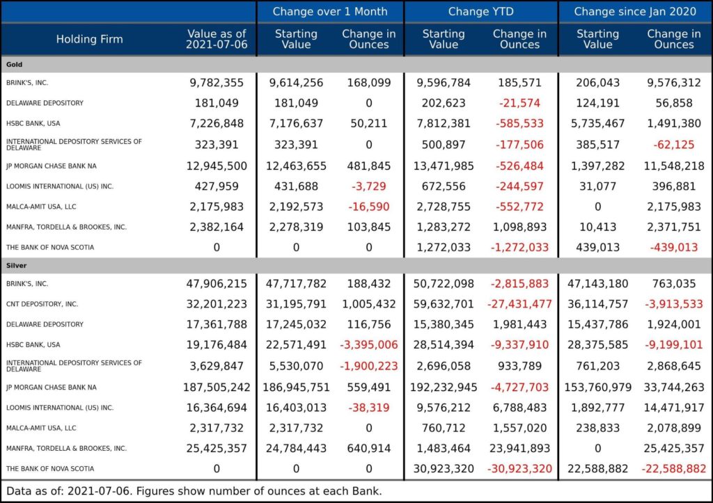
Figure: 9 Stock Change Detail
Data Source:https://www.cmegroup.com/
Data Updated: Nightly around 11 p.m. Eastern
Last Updated: Jul 06, 2021
Gold and Silver interactive charts and graphs can always be found on the Exploring Finance dashboard: https://exploringfinance.shinyapps.io/goldsilver/


 Money Supply is a very important indicator. It helps show how tight or loose current monetary conditions are regardless of what the Fed is doing with interest rates. Even if the Fed is tight, if Money Supply is increasing, it has an inflationary effect.
 The analysis below covers the Employment picture released on the first Friday of every month. While most of the attention goes to the headline number, it can be helpful to look at the details, revisions, and other reports to get a better gauge of what is really going on.
 In February, the data showed that Yellen was making a big bet that long-term rates would not stay elevated for long. This was demonstrated by the volume of short-term debt issuance. The Treasury was willing to pay higher rates to keep the maturity of the debt shorter.
 Please note: the CoTs report was published on 03/22/2024 for the period ending 03/19/2024. “Managed Money” and “Hedge Funds” are used interchangeably. The Commitment of Traders report is a weekly publication that shows the breakdown of ownership in the Futures market. For every contract, there is a long and a short, so the net positioning will always […]