

Jobs: Household Report Jumps but QCEW Shows Job Market is Not as Strong

The analysis below covers the Employment picture released on the first Friday of every month. While most of the attention goes to the headline number, it can be helpful to look at the details, revisions, and other reports to get a better gauge of what is really going on.
Current Trends
The BLS reported a gain of 303k jobs. This exceeded expectations of about 200k. The Household Survey, which had been trailing the headline number, saw a blowout gain of 498k.
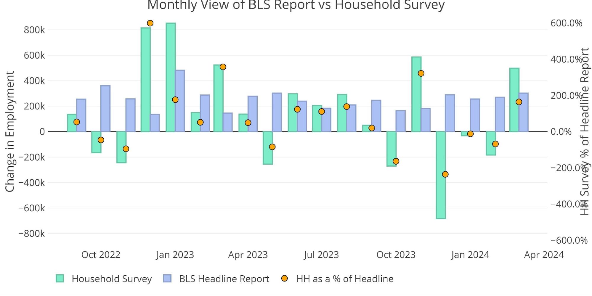
Figure: 1 Primary Report vs Household Survey – Monthly
Despite the massive Household blowout, for the year, the Household still trails the Headline report by the widest margin ever. The Household report is showing 34% of the Headline number for the year (283k vs 829k).
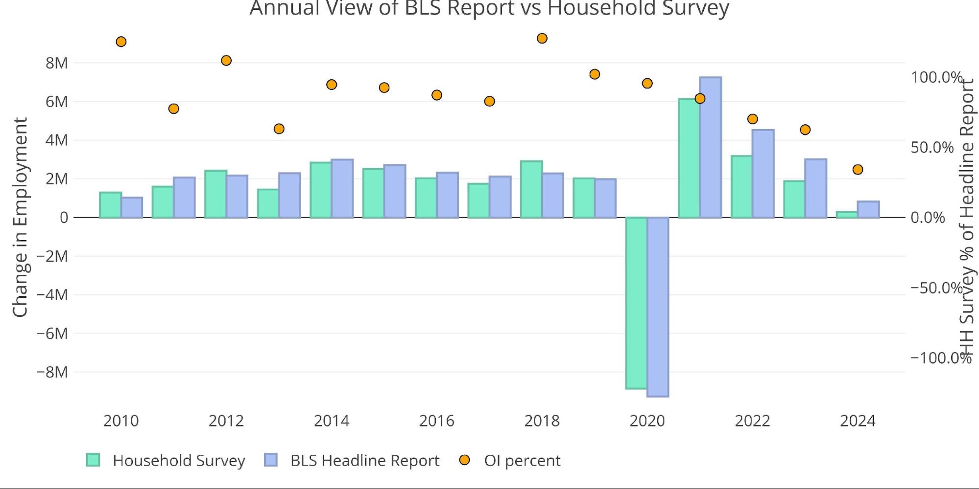
Figure: 2 Primary Report vs Household Survey – Annual
The BLS also publishes the data behind their Birth/Death assumptions (formation of new business). In March, the BLS actually assumed a job loss in their birth/death assumptions.
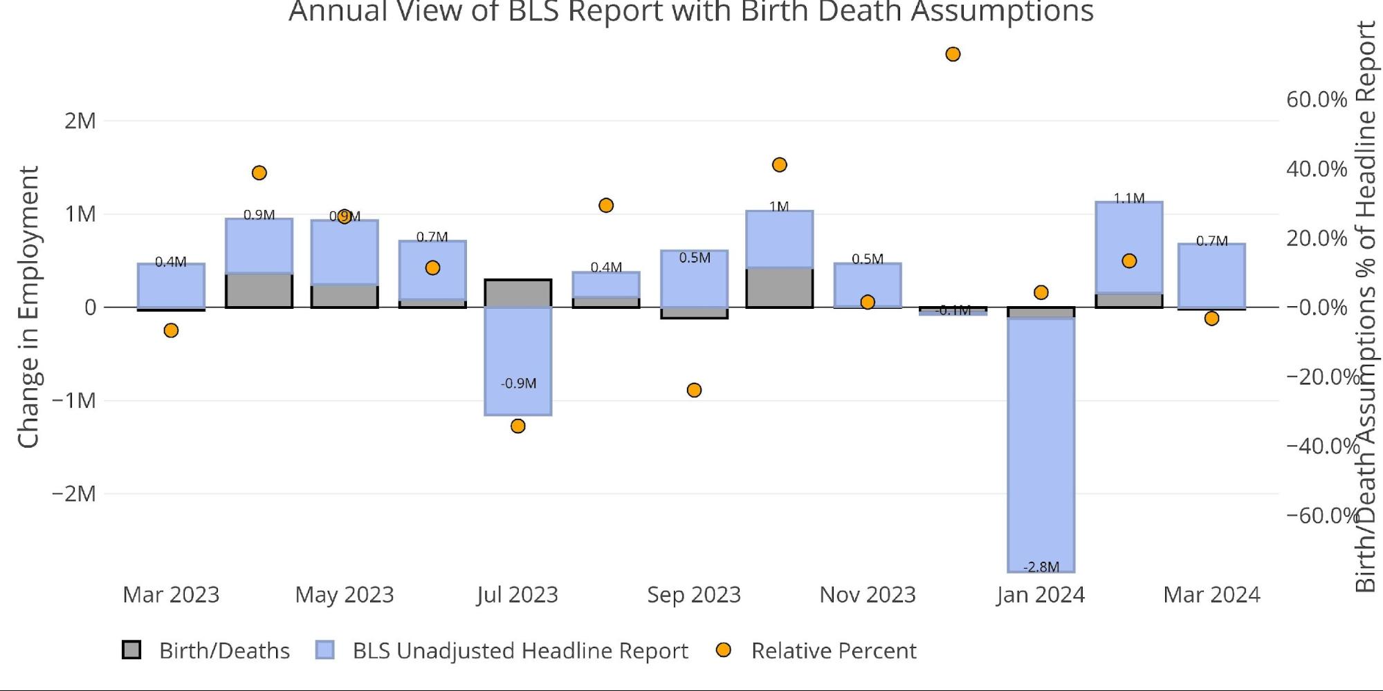
Figure: 3 Primary Unadjusted Report With Birth Death Assumptions – Monthly
There is another report published by the BLS called the Quarterly Census of Employment and Wages (QECW). According to the BLS, this is a far more accurate and rigorous report covering 95% of jobs available at a highly detailed level. Due to the rigor, the report is released quarterly on a 7-month lag. The latest report was published at the end of February to show Q3 2023.
Similar to the Household Report, the QECW has been over the headline number in recent periods but still trails on a yearly basis. Below are the monthly numbers.
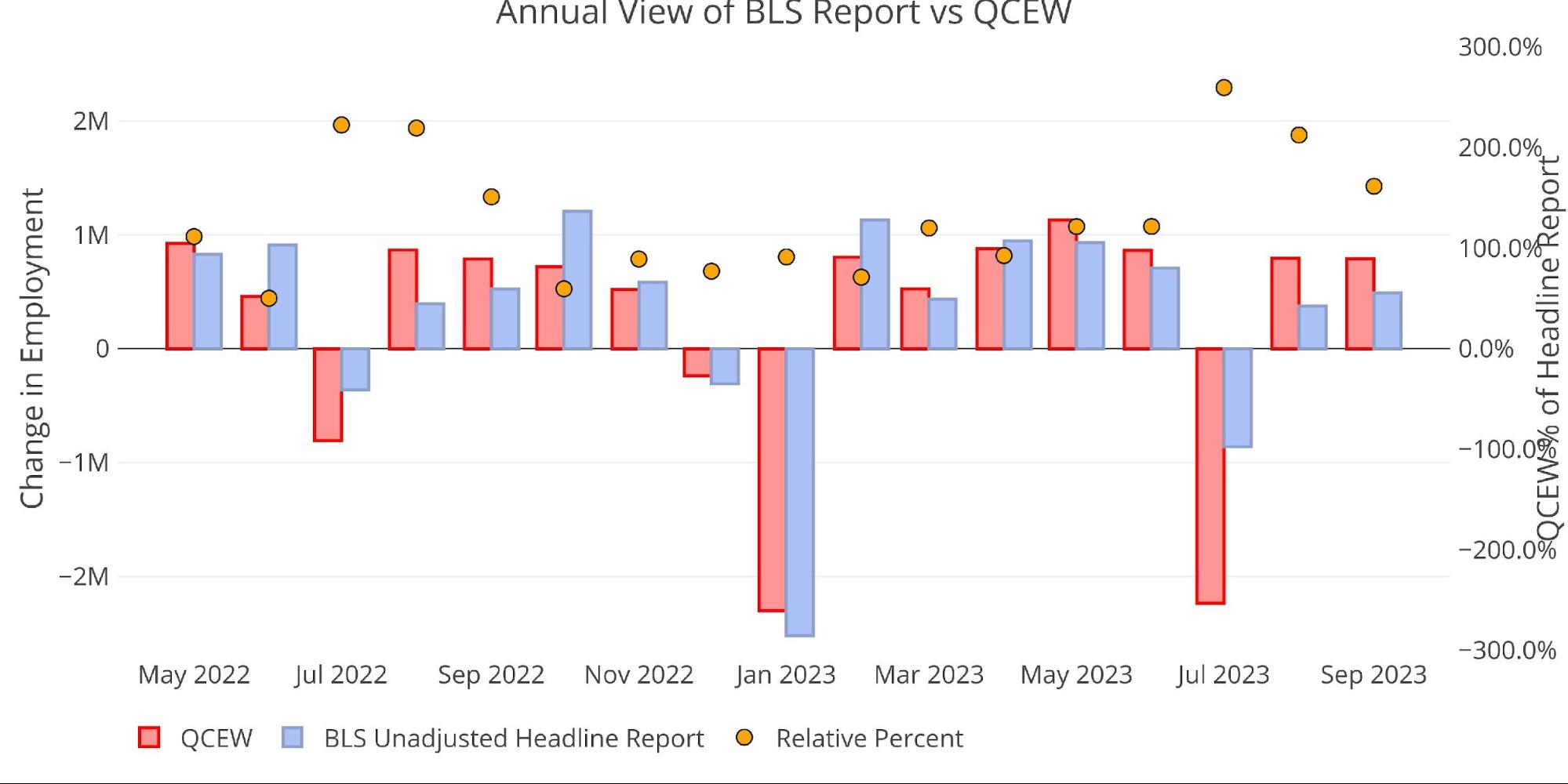
Figure: 4 Primary Report vs QCEW – Yearly
On an annual basis, you can see that the QCEW trails the Headline number representing 92% and 76% for 2023 and 2024.
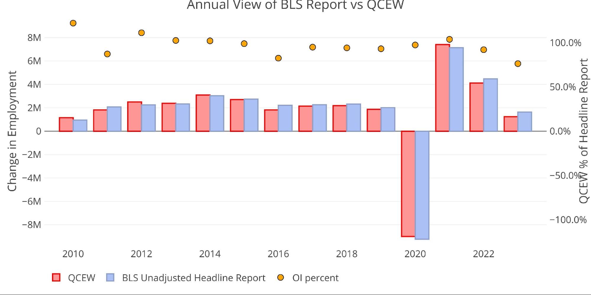
Figure: 5 Primary Report vs QCEW – Yearly
Digging Into the Report
The 303k jobs surprised to the upside with the unemployment rate dropping slightly from the near-term high last month.
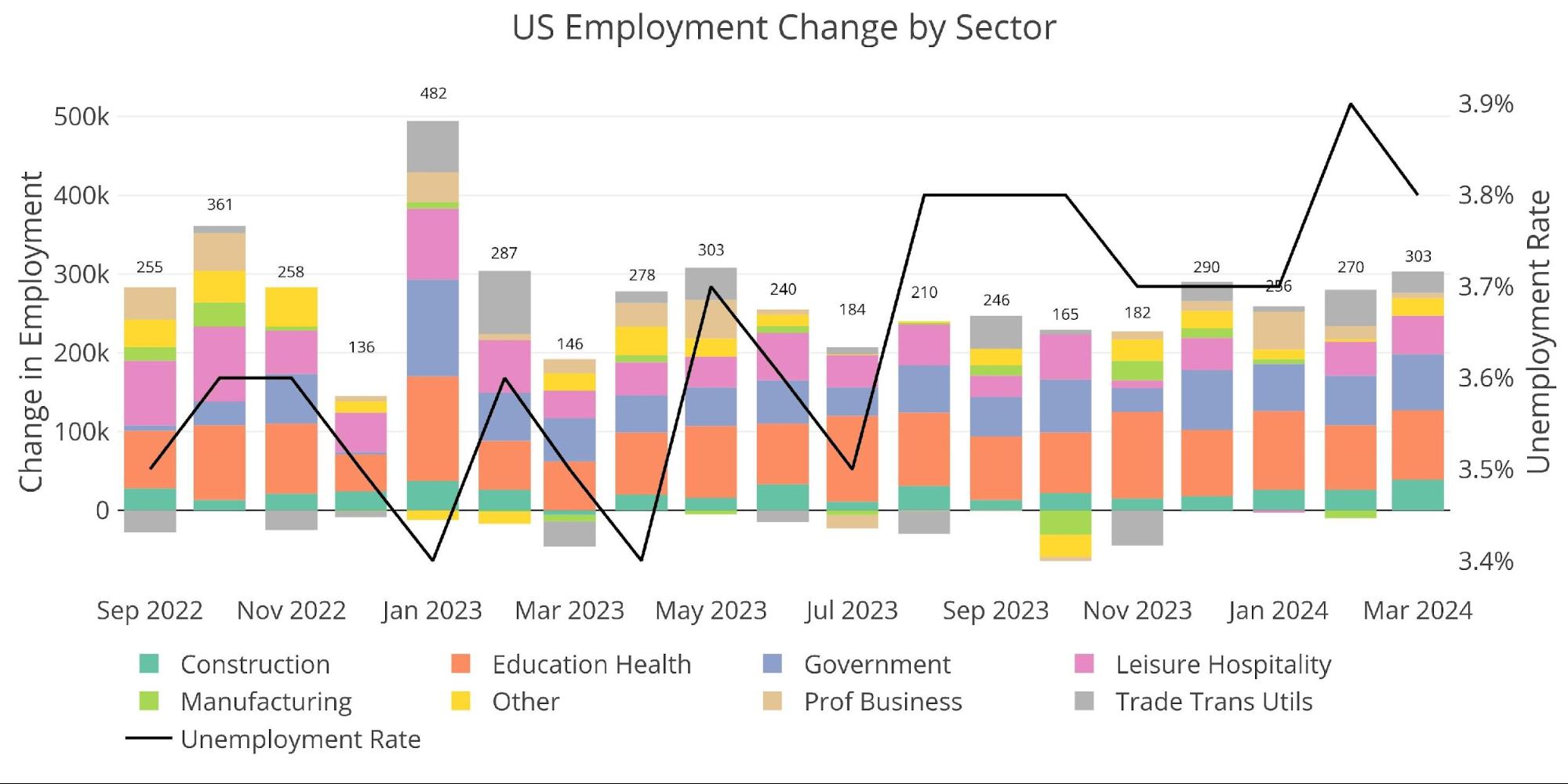
Figure: 6 Change by sector
The number of multiple job holders dropped again this month.
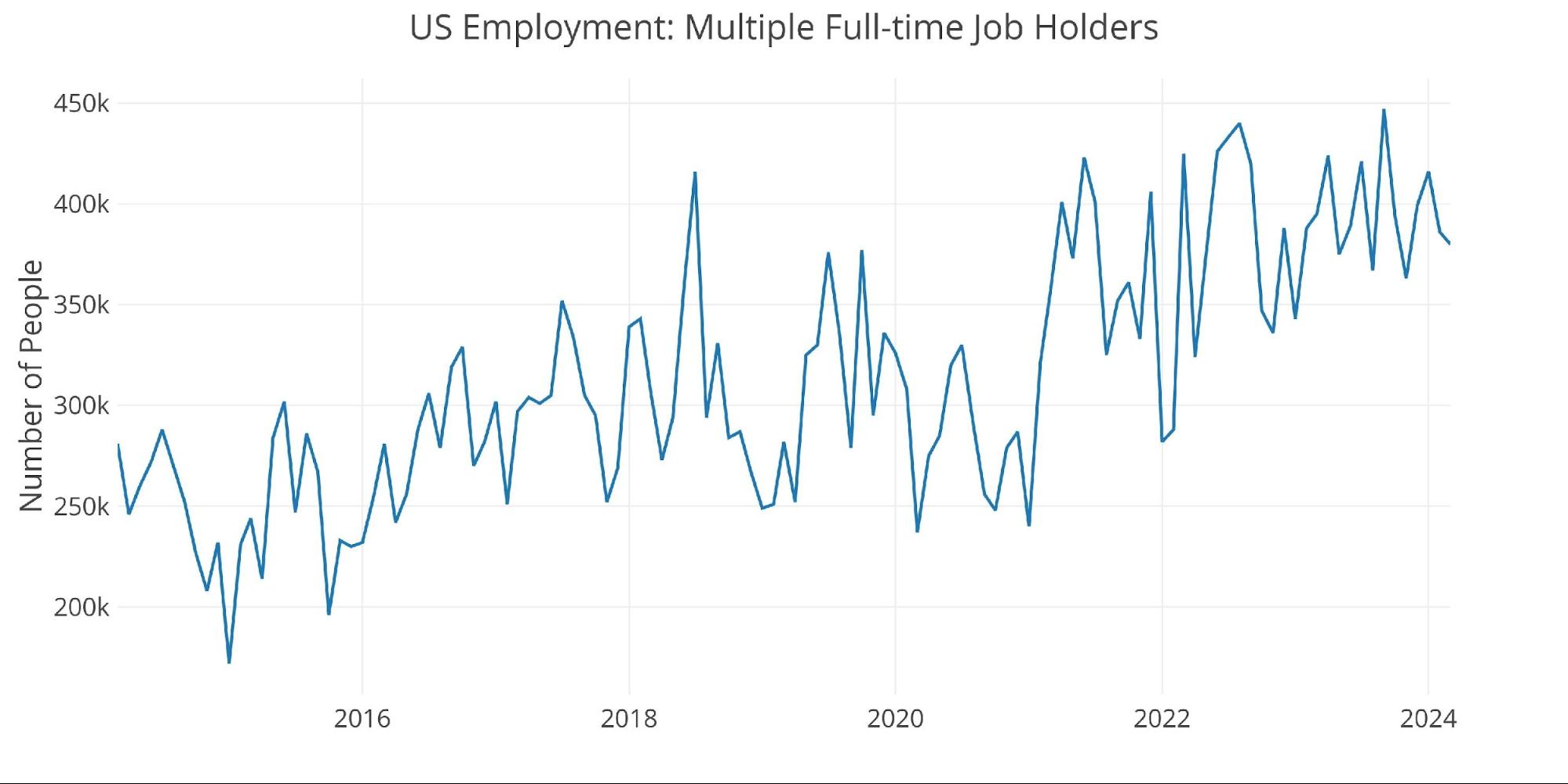
Figure: 7 Multiple Full-Time Employees
Jobs by Category
Several categories saw some large gains, with only three categories below the 12-month trend (Education, Prof business, and Manufacturing).
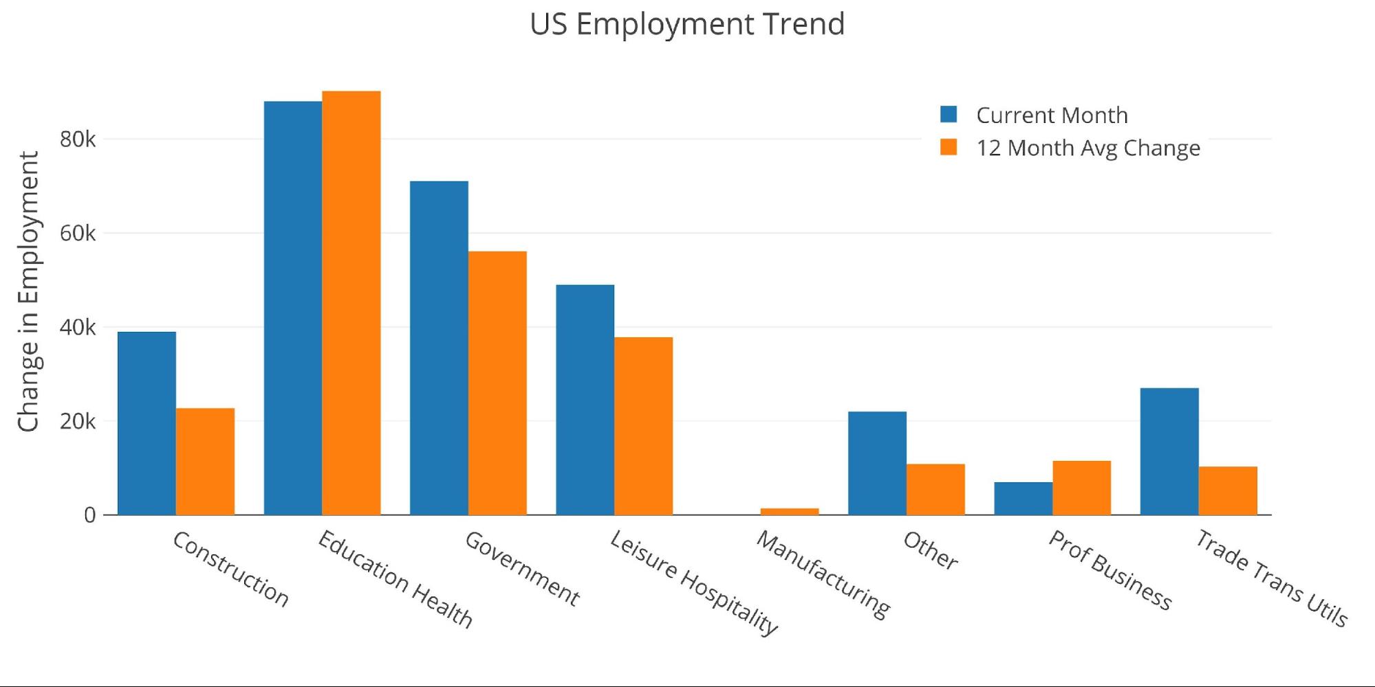
Figure: 8 Current vs TTM
The table below shows a detailed breakdown of the numbers.
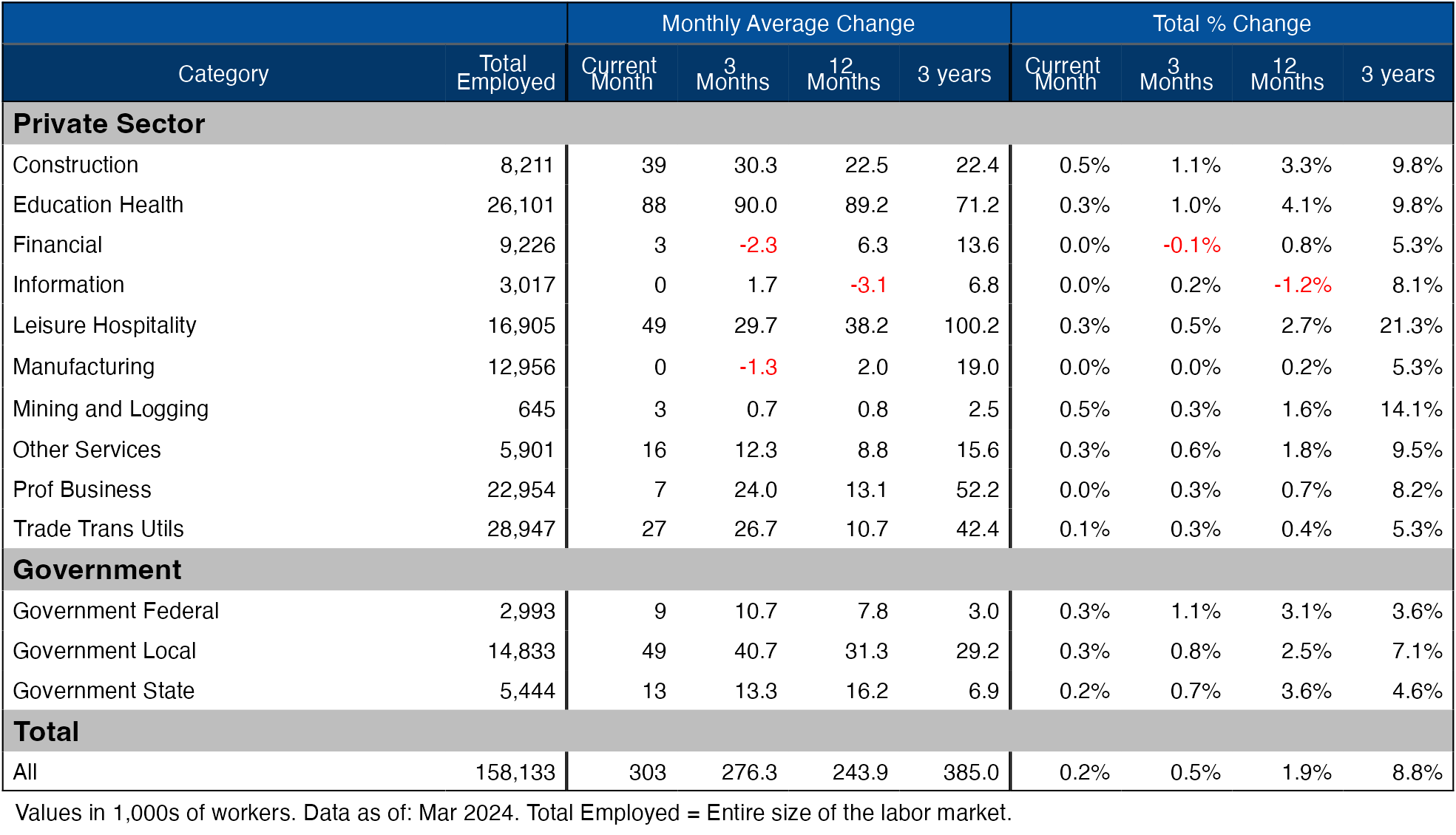
Figure: 9 Labor Market Detail
Revisions
Over the last three months, the data has been revised down by an average of 9.3k per month and 14.2k over 12 months.
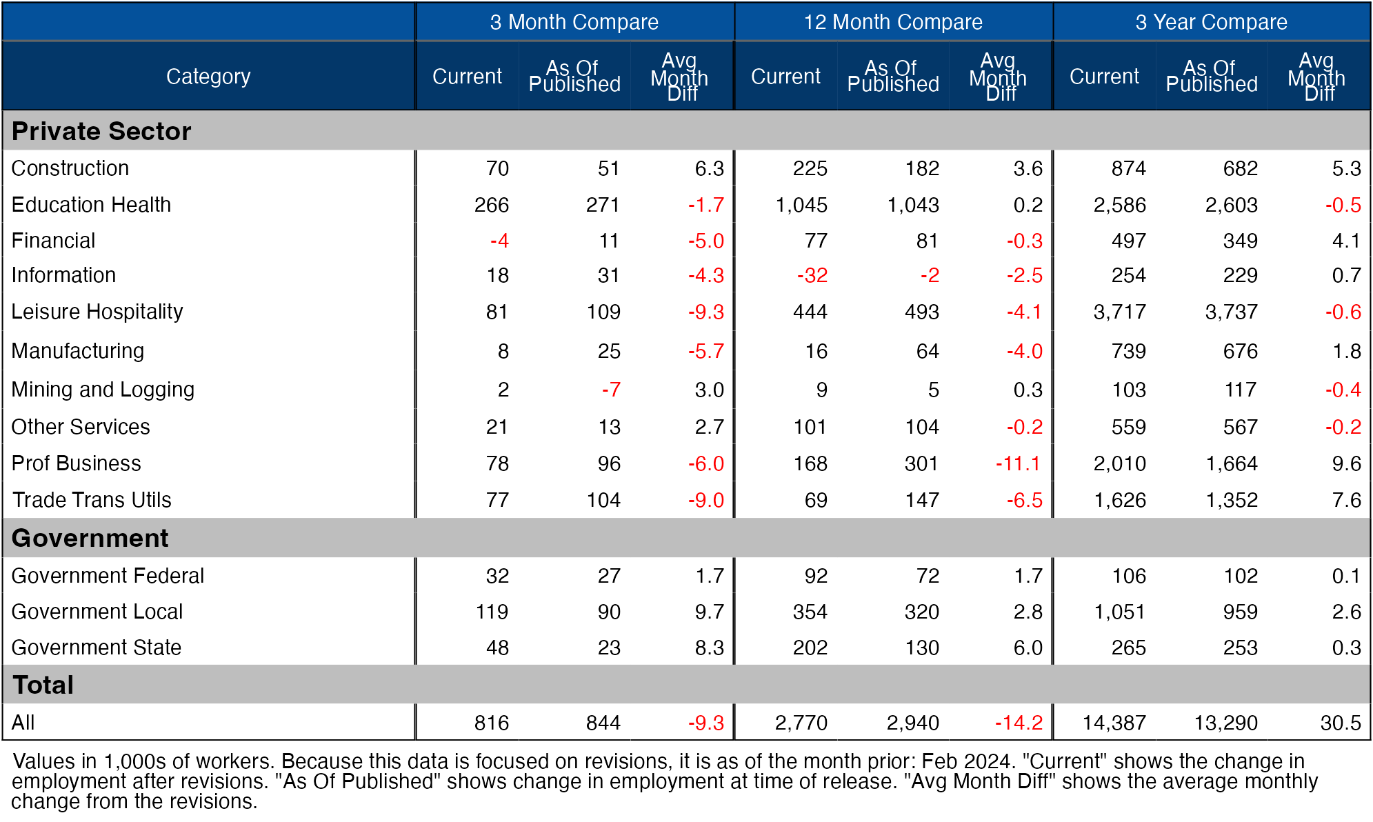
Figure: 10 Revisions
Historical Perspective
The chart below shows data going back to 1955.
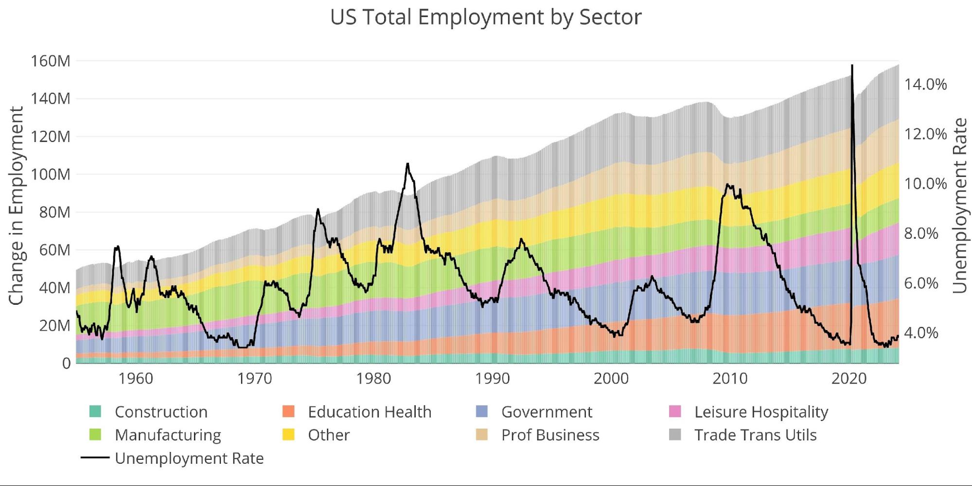
Figure: 11 Historical Labor Market
The labor force participation rate is still well below the highs before the Global Financial Crisis. This month it climbed to 62.7%.
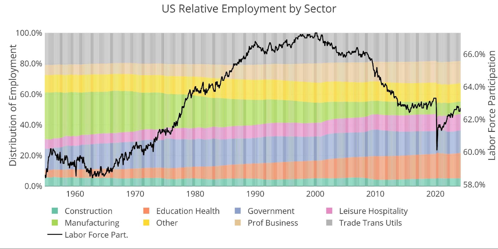
Figure: 12 Labor Market Distribution
Data Source: https://fred.stlouisfed.org/series/PAYEMS and also series CIVPART
Data Updated: Monthly on first Friday of the month
Last Updated: Mar 2024
Interactive charts and graphs can always be found on the Exploring Finance dashboard: https://exploringfinance.shinyapps.io/USDebt/

 This analysis attempts to look at different metrics to understand the current momentum in the gold and silver markets. It is meant as an analysis of potential price direction in the very short term (1-2 weeks).
 The Comex report last month showed a lot of strength in gold which directly preceded a massive up move for the price of gold. The data is looking similar in silver this month!
 Money Supply is a very important indicator. It helps show how tight or loose current monetary conditions are regardless of what the Fed is doing with interest rates. Even if the Fed is tight, if Money Supply is increasing, it has an inflationary effect.
 In February, the data showed that Yellen was making a big bet that long-term rates would not stay elevated for long. This was demonstrated by the volume of short-term debt issuance. The Treasury was willing to pay higher rates to keep the maturity of the debt shorter.