May 6, 2025
For thousands of years, gold and precious metals have been used as money. Gold’s scarcity and finite quantity make it a stable and predictable way to preserve wealth. Even in today’s financially uncertain world, gold and silver are still among the most stable commodities to buy. While central banks manipulate interest rates, print more money, and help drive inflation, the value of gold continues to remain steady decade after decade.
Today, it’s easier than ever to make gold and silver part of your portfolio. SchiffGold’s precious metals experts will walk you through where and how to buy gold and where to buy silver. Whether you’re considering home storage or converting your IRA into precious metals, the team at SchiffGold will take the time to understand your individual needs and goals in order to provide sound guidance on buying gold and silver.
Get Started Today


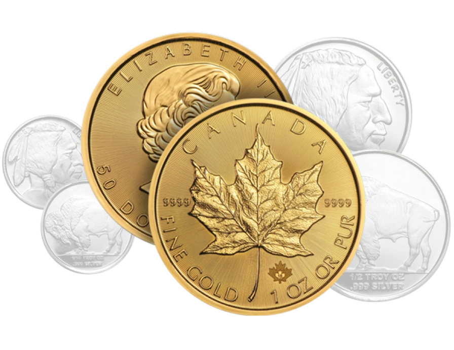
I have long recommended that investors put aside 5-10% of their portfolios in physical precious metals. But I was troubled to hear stories of my clients getting swindled by dishonest gold dealers. In 2010, I launched Euro Pacific Precious Metals to offer the highest quality gold and silver bullion at competitive prices, and we have since enjoyed tremendous investor acceptance.
My name has always been behind every ounce of gold we’ve sold. Now, I’ve decided to put it on the door, so you know that you’ll always be getting an honest deal from a name you can trust.
I'm pleased to announce our rebranding as SchiffGold. We offer the same personal service you’ve come to expect paired with an even stronger commitment to deliver the lowest prices in the industry.
SchiffGold’s motto is “discount prices, full service” and I'm committed to making our name – my name – synonymous with sound money. When you are ready to have an honest conversation about protecting your savings, give us a call.
Sincerely,

Peter Schiff
Founder & Chairman
SchiffGold, Inc.